The first thing a customer notices about a company or a business is its logo. The better the logo, the more it will attract customers. And the more customers, the higher the chances of business growth. So, if you want your business to grow, you will have to work on the things necessary for a business’s growth. The logo is one of those basic things that will help your business grow significantly. You need to ensure that you pick the right logo when selecting one.
Before reading about the different types of logos, you need to know exactly what a logo is. It is a combination of images and typography. Additionally, each logo is unique in its own way and has its own flavor. These logos are essential for brand recognition, identity, and a lasting impression on customers. There are dozens of different types of logos available on the market, and each logo is different from another one in its own way. In this article, we will explore a few categories of logos.
1- Emblems
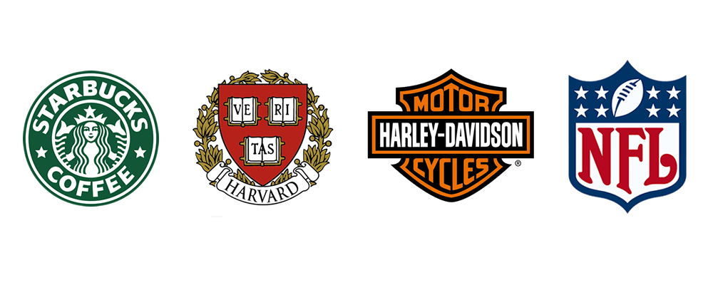
Have you seen the logo of Harvard University? If yes, then that is an example of an emblem logo. It is a type of logo in which text, a symbol, or an image is inculcated inside a geometric shape. Additionally, the symbol, icon, image, or text can be enclosed inside a circle, square, or shield. In the emblem logo, both the text and imagery are included in the same design.
Check out our latest designs for Emblems logo types.

Advantages
There are several advantages to this type of logo. One of them is that it provides a nostalgic and traditional feeling. That is exactly why most traditional universities like Harvard and Yale and organizations like NASA and the NFL are using the emblem logo. Additionally, the emblem logo gives an official look to your brand, which is why most professional organizations like Starbucks or MasterCard are using emblem logos.
Some popular brands in the automobile industry, i.e., Ford and BMW, are also using emblem logos. However, companies have recently changed their stance and have decided to update their logos to better align with modern sensibilities. For instance, KIA recently debuted a new wordmark-based logo after using an emblem in the past. The new logo, which resembles a handwritten signature, gives the business a contemporary and fashionable look that represents its changing brand identity.
Disadvantages
The emblem logos have very intricate and small sizes, which makes it very difficult to resize or redesign them. Additionally, emblem logos can lose some of their effectiveness when scaled down because the details can become hazy and difficult to make out. Moreover, emblem logos on large billboards or other oversized displays can be difficult to read or identify. It may be challenging for viewers to comprehend the tiny text or intricate details if they are lost or distorted.
2- Pictorial Marks
It is one of the most well-known types of logos, consisting of a simple and easily recognizable graphic or image. This type of logo is used by brands and companies that want to convey their message or identity through visual images. Additionally, these logos hardly have any sort of text. The logos of Apple, Nike, and Twitter are examples of pictorial marks.
Checkout our latest designs for Pictorial Mark types.

Advantages
Unlike emblem logos, these logos can be used in different contexts and different places. Pictorial marks have the benefit of being extremely adaptable and can be used in a variety of settings, from tiny icons on mobile devices to large-scale displays like billboards and storefronts. Due to the image’s potential to evoke specific feelings or associations, it is also successful in creating an emotional link with customers.
Disadvantage
One of the biggest disadvantages of pictorial marks is that they cannot effectively communicate the brand’s name or message because they lack any text message or name of the brand. Additionally, for new or lesser-known brands attempting to carve out their identity in a crowded market, this can be difficult. Additionally, because pictorial marks frequently rely on straightforward or universal images that can be challenging to differentiate from other logos, they might be more challenging to trademark and protect.
3- Wordmark logos
A wordmark logo differs significantly from a conventional logo because it lacks any symbols, patterns, or emblems. Similarly, the brand name or business name is written in a distinctive and stylized font in this type of logo. Additionally, businesses that want to create a strong visual connection between their name and their company identity frequently use this logo.
Checkout our latest designs for Wordmark logo types.

Advantages
The Watermark logo’s distinctive style and font make it very easy to recognize, which is one of its major advantages. The use of wordmarks as logos by well-known brands like Coca-Cola, Google, Disney, Jeep, Subway, and FedEx is due to the fact that they are instantly recognizable even without the use of accompanying images.
Disadvantages
These logos do not include any visual images, which can be challenging for brands that are trying to evoke a certain mood or feeling in their marketing efforts. Additionally, wordmarks may be more difficult to trademark and protect, as they are often based on typography that may be similar to other logos or designs.
4- Monogram logos
In monogram logos, the initials of a business or brand are arranged in a distinctive and stylized way. These logos are used primarily by businesses that want to create strong visual associations. Additionally, this logo aids in creating a powerful connection between the brand’s initials and its visual identity. HBO, CNN, H&M, IBM, and the BBC all use this style of the emblem.
Checkout our latest designs for Monogram logo types.

Advantages
When the initials are distinctive and easy to recognize, monogram logos can be very effective at creating brand identification and differentiation. Monogram logos, which are instantly recognizable and connected to luxury and sophistication, are widely used by brands like Louis Vuitton, Gucci, and Chanel.
Disadvantages
One of the main disadvantages is that the logo may be less effective at communicating the full brand name or message, as it only includes the initials. For new or lesser-known brands attempting to carve out their identity in a crowded market, this can be difficult. Additionally, because the initials must be arranged in a distinctive and attractive manner that correctly represents the brand identity, monogram logos might be more challenging to design.
5- Abstract logo
As the name suggests, the abstract logo has abstract geometric forms and elements that do not have any direct connection with the brand it represents. It does not have any recognizable image like an apple or a bird but has geometric shapes, lines, and colors to create a distinctive and memorable visual identity. An abstract logo relies on unique and artistic design elements to convey a brand’s identity.
Checkout our latest designs for Abstract logo types.

Advantages
When the design is distinctive, memorable, and aesthetically appealing, abstract logos can be very effective in creating brand awareness and differentiation. It is common knowledge that brands like Nike, Apple, and Starbucks use abstract logos as part of their branding because they are instantly recognizable and connected to invention and excellence.
Disadvantages
Abstract logos may be more difficult to create, as the design needs to be unique and aesthetically pleasing while accurately reflecting the brand identity.
Best Logo To Use For Your Brand
Ultimately, the best type of logo for your branding will depend on factors such as the nature of your business, your target audience, and your overall brand personality and message. It’s important to work with a professional designer who can help you choose and create a logo that will effectively represent your brand and help you achieve your marketing goals. In our point of view, the best type of logo is the one that has the brand name and a recognizable image or icon to represent the brand. So we prefer logos with Monogram styling. Overall, your logo should be designed with the intention of creating a lasting impression on your audience. It should be easily recognizable, unique, and memorable so that it becomes a powerful symbol of your brand and what it stands for.


