BMW stands for Bayerische Motoren Werke AG. It is a German-based car manufacturing company that was founded in 1916. It manufactures thousands of cars each year. According to official recordings, BMW has manufactured more than 200,000 vehicles, which makes it the 14th largest producer of motor vehicles in the world. It produces every type of motor vehicle, i.e., sports cars, touring cars, and the Isle of Man TT. The headquarter of BMW is located in Munich, Germany, and it has many other headquarters in countries like Brazil, China, India, Mexico, the Netherlands, South Africa, the United Kingdom, and the United States.
It is one of the most famous vehicle companies, but its logo is more famous than the vehicle itself. BMW’s logo is distinct from the rest of the logos and occupies a unique position in the world.We will cover the history of BMW logos in the following article.
A concise history of the BMW logo
If you are curious about the history of the BMW logo, you do not need to worry because it is a natural phenomenon that people get curious about famous things. The BMW logo is one of the most famous, and it can be seen on roads, in showrooms, or on the back of many vehicles. That makes it more iconic. White and blue are colour palettes used by BMW, which are actually the official colours of the State of Bavaria in Germany. The Bavarian state is the home of BMW.
Additionally, this logo first appeared on the streets of Germany and other states in 1923. Where was the logo fitted? The logo was fitted to the fuel tanker of the motorcycle, from where it was picked up by other cars. The logo you see on the BMW vehicle is not the same one that first appeared at the beginning of this manufacturing company. It came went through many stages and changed significantly over the years. There are a few stages of BMW logo evolution each plays its own important role in the current logo of BMW.
1913-1917
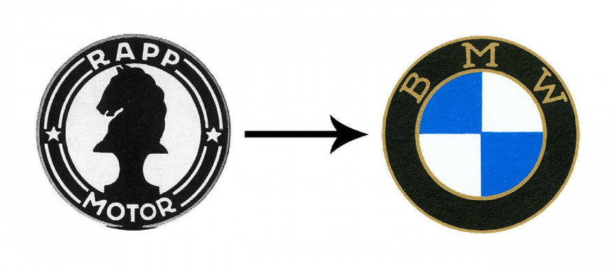
The first logo was designed in a way that there was a silhouette horse in the center of a circular frame. Additionally, the name, two stars, and eight curvy lines in white are all enclosed in a substantial black frame. This horse represented speed and power while there instead of BMW Rapp Motor was written in bold letters. The horse is looking left and appears to be galloping due to the raised position of its front legs. Eight curved lines resembling an airplane’s propeller blades encircle the horse. This logo was called the Rapp logo and represents the BMW Company as an aircraft engine maker.
1917-1933
This was the first ever colored logo for the company and was designed after much consideration and thought. Additionally, it added the company name BMW instead of a wordmark design. The Rapp Motor words were replaced by “BMW,” enclosed by two thick outlines. Two white and two blue quadrants were used to symbolize the Bavarian flag and the state where the company was headquartered, respectively. A thick black frame with a propeller design in the center gave the logo a contemporary and fashionable feel. The new emblem had two white and two blue colored quadrants that resembled an airplane propeller in the center of a substantial black frame.
1933-1953
After the redesign in 1923, there was a minor change in the logo in 1933. The changes enhance the look and style of the logo. The four quarters that were present in the first logo were maintained, and the blue and white colors represent the Bavarian flag. However, there was a slight change in the outlines, which were made thicker to make them more prominent and easier to recognize. Additionally, the wordmark was made bolder and sharper, giving the logo a more modern and sophisticated look.
1953-1963
The logo was significantly altered in 1953, with a focus on the color pellet. To add some elegance and a personal touch, thin silver outlines around golden circular frames were added to the logo. Additionally, after World War Two, the demand for luxurious and refined vehicles increased due to which a golden BMW letter mark was made gray making it more subtle and less flashy. To distinguish the BMW from other vehicles, the blue and white colors inside the circular frame were made lighter. Additionally, the black ring was made more visible to make the logo more visible on various media, including print, television, and digital platforms.
1963-1997
This change in the logo was a bit different because it was simpler than the previous logos. Though, there were several changes in the logo, one of them was the use of a white font for the BMW wordmark on a black circular ring. One of the reasons for this change was to make the logo more modern and elegant. This change was solely made for the company’s goal of producing high-end luxury cars. Additionally, the change was simpler and more attractive than the previous logos. Furthermore, the black and white colors in the lines give a sense of timelessness and authority. This feature makes the BMW a great choice for those who like a similar, simpler vibe.
1997-2020
At the end of the 20th century, technology was starting to make its impact, which was seen in many areas. One of them was a logo. A 3D shape appeared for the first time in the history of the BMW company logo, making this logo completely different from all the rest. The silver-gray outlines around the large circular background that the white BMW wordmark was now set on gave the emblem more depth and dimension. One additional thing was about the black lines dividing the quadrants from both ends. It was a significant change because it made the inner blue and white more apparent and clear while adding more contrast to the logo.
2020-Present
But just after three years, the company said goodbye to the iconic 3D design and made the 2D logo its official logo. The new logo depicted the future and modern times. One significant change in this new logo is the replacement of the dominant black frame with a thick white frame, giving the logo a more open and airy feel. As there were black lines dividing the quadrants in the previous logos, they were replaced in this one. This modification also increased the prominence of the blue and white hues, giving the logo a feeling of balance and harmony.
Conclusion
The current logo of BMW went through different stages and experiments, which explains why it is considered one of the best in the market. There have been a lot of changes in the logo over the past few decades, but the basic elements have remained the same. The BMW logo now stands for style, power, and ingenuity. It stands for the company’s dedication to greatness and quality.


